Monday, 12 December 2011

Cars and Christmas

Clive Sutton postcard for
Top Gear Live 2011 (London)
Morning all.

I can't believe Christmas is almost upon us and 2012 is just around the corner. 2011 has been a really good year and I've worked on some great graphic design projects for clients in Harrogate, York, Leeds, London and Surrey. In fact, as the year has progressed, Howabout Creative Solutions have been getting busier and busier, which is testament to the quality of work produced.

With that in mind, here are a couple of recent projects, the first of which is a postcard designed for Clive Sutton for their stand at the Top Gear Live 2011 show in London. The double sided postcard highlights some of the services offered by Clive Sutton, and is a very image led design (and brand led) design that looks visually appealing.

Item number two is a direct mailer for York Test Laboratories in York. The theme was a festive one, without being to twee and clichéd and while we chose the wrapped-up present concept, I think we did it in such a way as to be different and eye-catching. As ever with these direct mailers, space has to be left at the top left for name and address details to be inserted.

York Test Laboratories December direct mailer
The start of 2012 is already looking quite promising with projects that seem set to go ahead in January and beyond, but with a busy couple of weeks before Christmas it's time for me to knuckle down and get creative, so tunes on (The Jezabels), InDesign launched, and here we go...

Please click on the link below to see further examples of my work.

Visit www.howabout.co.uk


Wednesday, 16 November 2011

Focus and fruit

Solace Focus, November 2011 issue
Hello from Howabout Towers.

Here are a two recent projects I have been working on. The first one is a quarterly pdf magazine for the 'Society of Local Authority Chief Executives and Senior Managers'. It's quite a nice publication to work on, although the content is fairly dry and there isn't a huge amount of opportunity to be creative with images. It's very much information driven - clean and concise with an easy navigation system and external email and web links. It usually runs to between 45 and 60 pages and has a relatively quick turnaround time. The supplied copy is written to a fairly polished standard, so text amends after design has begun are pretty light, and that obviously helps immensely with the whole process.


YorkTest Laboratories direct mailer
The second project is for YorkTest Laboratories, for who I do a lot of design work. Featured here is the latest direct mailer, aimed at customers who have taken an initial food intolerance test but can now go into more detail with a second test and find out which foods specifically they are reacting to.

As ever with YorkTest design briefs, there is good potential to mix some nice typography with great images of food and drink. It's sometimes tempting to use multiple food images as there is a whole array of ingredients that are tested, but on this occasion I thought it would be good to focus on just one really nice image. I think the interaction between image and copy works well, and the curve of the bubbles leaves the all important space top left to include the recipients address.

Please click on the link below to see further examples of my work.

Visit www.howabout.co.uk

Tuesday, 1 November 2011

Photography exhibition


This is a recent graphic design project that I did for Acceleris in Harrogate for their client the Shipwrecked Mariners' Society. My brief was to design an invitation (shown below) to a wonderful photography exhibition and also the accompanying exhibition brochure (front and back cover spread, and inside spread shown above).

The Shipwrecked Mariners' Society put on the exhibition called ‘Celebrations of the Sea’ – the world’s first photography exhibition underwater featuring images of individuals whose lives are dominated by the ocean. It opened at the Sea Life Centre in Brighton on 21st October and then travels around several more Sea Life Centres through November and into December.

It was a brilliant project to be part of - not only was there the opportunity to be creative with the design of the brochure and invite, but the images from the exhibition were, of course, amazing.

The brochure briefly featured each of the people represented in the exhibition, as well as highlighting the work of the Shipwrecked Mariners' Society themselves. As they state in the introduction to the brochure...

'Celebrations of the Sea aims to honour the maritime industry’s unsung heroes. From the fishermen who brave the UK’s stormiest seas and traditional lobster pot makers who keep precious traditions alive to our most talented celebrity chefs who transform fish into some of the nations favourite dishes – all are celebrated in this unique and special photography exhibition.

'Born out of a partnership between national maritime charity the Shipwrecked Mariners’ Society and renowned underwater photographer and TV Producer Kate Westaway, the project is a celebration of those hardworking individuals who work in and around the sea.'

Without a doubt, this is my favourite graphic design project that I have worked on this year and I'm very pleased with the end result.

Please click on the link below to see further examples of my work.

Visit www.howabout.co.uk

Wednesday, 19 October 2011

Further OCS spreads and design banter


I have attached a couple of further spreads from the recent OCS annual report that was recently completed because, well, I'm pretty proud of that particular job so thought it was worth another shameless plug.

It has continued to be a manic few weeks on the graphic design front and I have done plenty of work in both Leeds and Harrogate as well as for clients in York and London. It certainly makes for a varied and unpredictable working week, which is great. The recent work has included collateral for the banking sector, the automotive sector, the healthcare sector and some nice work for a photography exhibition (visuals to be displayed here soon).

The only downside to this hefty workload is that I have let the blog updates slip a little, but hey, that can't be helped. On that note, I'll sign off here and get back to the next design job, as deadlines are looming.

Over and out.

Visit www.howabout.co.uk

Tuesday, 4 October 2011

OCS Annual Report

It's been busy recently. Really busy in fact. As well as doing some interesting graphic design projects from my base here in Harrogate, I have also been helping out at agencies in Leeds and also on t'other side of Harrogate. The days have been long, sometimes the weekends have been interrupted by design jobs too, but it's been good fun.

Attached here is an example of an annual report that we designed for OCS (feel free to click on the image for a better view). It was a great project to be involved with - a really satisfyingly chunky piece of work that came with a suitable budget to do it justice. It allowed us to use nice (largely stock) photography, use a fifth special colour in the printing process and make use of a nice paper stock. Myself and Tim Moat worked on the design side, while Richard Spencer was the wordsmith - I think we made a great team.

The process was a relatively smooth one too, and once the job had been signed off and gone to print, I worked on an interactive pdf version. We obviously knew this was going to be a requirement, so when I set up the initial templates and style sheets, I created some navigation buttons on a hidden layer in InDesign that could be activated at a later stage. There was some additional navigation to manually create too, mainly from the contents page, as the size of the overall document meant that it was spread over several InDesigns 'books' that were stitched together later on.

All in all, it was a great graphic design job to work on, and I am delighted with the end result.

As ever, music and design have been working in sweet harmony. I recently saw Gruff Rhys (of Super Furry Animals fame) do a great gig at Harrogate Theatre. It was suitably weird, brilliant, unpredictable and enjoyable. Next up I'm off to see Miles Hunt (of Wonderstuff fame) play a gig in Carlisle (I'm a bit of a sucker for all things Stuffies), and then it's Fleet Foxes in Leeds later on in the year. Fab!

Visit www.howabout.co.uk

Tuesday, 13 September 2011

Healthcare examples

Morning world and welcome to a blustery Tuesday morning in September.

Beaucare Medical

Today I thought I'd showcase a couple of recent bit of graphic design work completed for clients in the healthcare sector, starting with a press ad for Beaucare Medical in Harrogate (shown above). Its a monthly full page ad that appears in Caring UK magazine and focuses on a selection of the products they offer.

Bradfern
Below is the front page of a 2 page A4 leaflet designed for Bradfern in Oldham, again it showcases some of the products on offer for care homes and the like. This is the first of what will hopefully be a suite of promotional materials, each one focusing on different areas of the business.

Actually, I haven't listed the tunes that have been spinning on the Howabout hi-fi for a while now have I!? A man can't design in total silence after all. Well I can't anyway. A look on the iTunes 'recently played' list indicates it's Fleetwood Mac, Prodigy, Ozric Tentacles, Rolling Stones, NWA, Fleet Foxes and Dinosaur Jr. Not bad...

Visit www.howabout.co.uk

Tuesday, 30 August 2011

"The best brochure I have ever had designed."


What a successful and enjoyable graphic design project I have just completed for YorkTest Laboratories in York. I was asked to design a guidebook (page samples above) and diary (page samples below) for their DrinkScan programme, which helps to establish whether customers are intolerant to various ingredients in drinks. Obviously they needed to have the same theme running throughout to make it clear they were sister publications and as the subject matter was drinks, I decided to use a nice, clinical image of clear water as an striking cover (which also reflected the tone of the DrinkScan logo nicely).

The turnaround on the job was very fast - just under a week from the initial brief being taken to print ready artwork being delivered for printing. Not bad for one 16 page A5 document, and one 28 page A5 document. But even better was the feedback from Laura Seaton, Senior Project Manager at YorkTest Laboratories...

"I have been working in marketing for 13 years and it is the best looking brochure I have ever had designed."

Praise indeed!


The graphic design process was helped by virtually faultless copy being supplied by the client, and we selected a nice array of images to work with (although we padded them out with some additional ones from my archives that I thought would work well). I think it's a great example of the quality of design work that can be produced by Howabout Creative Solutions even when time is of the essence.

We now have a little more time to produce a DL size sales brochure to accompany the diary and guidebook, which again will follow the same theme, so the end result will be a really nice suite of publications.

I really hope to get more projects along these lines as I love doing them, and when I get feedback such as this from clients, the buzz is amazing. Check out my website for further work - the link is below.

Visit www.howabout.co.uk


Monday, 15 August 2011

Wales, Led Zeppelin and art.

Good Monday morning all. I'm back in front of the Mac after a weeks camping in mid Wales. It was awesome despite the mostly rainy weather - a nice mix of culture and campfires, beaches and barbeques, nature and nonsense.

I was pleasantly surprised to find we were camping just a stone's throw from Bron Yr Aur - the cottage made famous by Jimmy Page and Robert Plant of Led Zeppelin and where they wrote much of 'Led Zeppelin III' and various other tracks that appeared on 'Houses of the Holy' and 'Physical Graffiti'. Of course I had to play the song 'Bron Yr Aur' on my iPod while standing round the campfire (on more than one occasion actually), in homage to one of the greatest bands of all time.

We made a visit to the Museum of Modern Art in Machynlleth too (http://www.momawales.org.uk/) which is a fab place. As well as featuring a wonderful exhibition of paintings by Matthew Wood, the place was also gearing up for the Machynlleth Festival and our visit coincided with some great folk music from Chile, which my daughter adored and (rightly so) insisted we stop and listen to a while.

The Centre for Alternative Technology (http://www.cat.org.uk/) was another inspiring place to visit. It's one of those places where, as well as the expected green and eco-friendly solutions for sustainable living that are on display, you will stumble on nice, quirky pieces of design such as slabs of slate featuring typography and carved elements of trees; sculptures of hares out-running a fox; and living-willow tunnels for kids to dash through. I would love to return (and I would love it not to be raining when I do!).

Aberdyfi is gorgeous, the mountains amazing, the sandy beaches fun-filled and the wildlife spectacular. For now it's back to designing and creating though...

Visit www.howabout.co.uk

Thursday, 21 July 2011

Work, music and holidays


Busy, busy, busy... that's what I've been lately. Which is great. Hope it stays that way. Actually it will definitely stay that way for the next six weeks or so, what with it being the school holidays. It definitely adds an extra dimension of complexity to the working day when you have a young daughter requiring attention, but its a nice problem to have. It means there will be enforced breaks from the computer screen too, which will be welcome, and also a couple of breaks away from home, starting with this weekends Deer Shed Festival in North Yorkshire. I'm really looking forward to it - I do like my festival fix each summer and this one sounds like a lovely family-friendly, chilled out affair. Despite the fact that we don't get there until Saturday, it's already started well, as I won a Deer Shed hoodie in a competition this week. Fab! I'll be suitably branded when onsite then!

There has been a flurry of graphic design activity with York Test Laboratories (in York) this month with a swathe of mailers coming through the studio (a selection are pictured above) - they are always nice things to work on too.

As well as that I have been helping out at Kariba in Harrogate, and continue to work with Acceleris MC, also in Harrogate, and Bradfern in Oldham. Oh and I've created a logo and collateral for Red Cat Property in Harrogate as well. One of the 'To Let' boards is shown here, so look out for them dotted around Harrogate and the surrounding area.


Almost as important as the work I've been doing is the tunes I've been listening to. This week, Fleet Foxes' 'Helplessness Blues', Gruff Rhys (who I saw at Harrogate Theatre this Monday playing a suitably brilliant, unpredictable, funny and unique gig. He's a talented fella, that man), Thievery Corporation and Death in Vegas.

Visit www.howabout.co.uk

Friday, 24 June 2011

Glastonbury (I should be there).

It's been a funny old week this one. The week felt odd to start with on Monday. There was graphic design work to do, quotes to submit and the usual marketing jobs to done, but something didn't quite feel right. And then I realised. It's Glastonbury week and I wasn't going to be there. I don't go every year by any means but me, my wife and young daughter went last year and the year before and it feels wrong not to be there this year. Oh I know it's going to rain and get muddy, but I was there in 2007 when it was like a monsoon for the entire weekend and still had a brilliant time (although admittedly I didn't have my daughter there that year as she was only one at the time).

I know I can catch it all on TV and the radio (in fact I'm tuning in as I type) but I don't know whether that makes me feel better or worse about not being there. I hear there are already folk whining about the appearance of U2 (but when is there not whining about the appearance of a particular headliner or lineup) but the festival is so much more than just about the live music. Since we started taking our daughter, I've seen less and less live bands but had a better and better time, as I get to see stuff I otherwise never would have (and I can remember what I saw when I get home too, which is always a bonus!).

As the festival takes a break next year it means the earliest opportunity to go back there is 2013, but I'm gonna do my best to make sure we are all there then. There really is no place like it. To soften the blow of missing it this year, we are going to attend Deer Shed Festival in North Yorkshire next month, which I am looking forward to. Oh and Gruff Rhys at Harrogate Theatre too.

Still, this week the likes of OCS, Beaucare and new clients Red Cat Property and Bradfern have kept me busy and means that Howabout Creative Solutions continues to produce a varied portfolio of graphic design work for clients regional and national.

Visit www.howabout.co.uk

Friday, 10 June 2011

KierTalk


It's been a few weeks since the last blog from Howabout Creative Solutions in Harrogate and that is largely due to the busy work schedule recently. I have been working on a variety of interesting design projects for a variety of both regional and national clients. It has certainly meant long hours, but really that's what gives me a buzz - I do love what I do.

One project that has really been fun to work on has been 'KierTalk' (with Charley Durham from Acceleris), the newsletter for Kier Building Maintenance. It's a 16 page tabloid magazine, and I've picked it up (from a graphic design point of view) at issue 7. Although the client considered implementing a 'design development' from the existing look (and liked the visuals I produced) it was decided that, for the sake of continuity, to run with the established look. However, that didn't mean there wasn't room for creative thinking and with that in mind I tried to inject some new design ideas into the layout. Headline fonts had a punchier look, pictures interacted more with the text, and graphic devices introduced to highlight facts and figures. The end was result was well received by both Kier and Acceleris which is great news and means that a really good platform has been established for the next issue.

Of course a few killer tunes have helped the creative process and what better way to choose the tunes by picking random letters from the alphabet. Wednesday was brought to me by the letter 'S' - Sisters of Mercy, Smiths, St Etienne, Stooges, Stranglers, Super Furry Animals and Seasick Steve, while Thursday featured 'P' - Penguin Café Orchestra, Primal Scream, PiL, Public Enemy, Polyphonic Spree, Police and Prodigy. I think like this way of choosing my tunes.

Visit www.howabout.co.uk

Friday, 6 May 2011

Bit more Inspiration


As promised from the last blog, I have attached a few 'live' photos from Acceleris's 'Inspiration Station' room in all it's glory. The results look even better now that the furniture is in place too, particularly as some of the colours from the graphics are picked out in the colour of the tables, stools and bean bags. It's nice to see the room being well used by folk as well - and there's even a quick poker lesson laid out on the blackboard wall - brilliant!!

Other work continues apace including one or two other projects for Acceleris (including a nice chunky tabloid magazine) and some new projects for Beaucare Medical.

I've also had the opportunity to work with my old mate Mark Frudd (http://www.markfrudd.com/) on a project, which has been nice. He's a very talented illustrator and is creating a gorgeous map of Harrogate to drop into a supplement for Acceleris. If you get the chance, I'd highly recommend checking out his stuff.

Inspirational music on the Howabout hifi recently has largely been provided by The Pogues, The Charlatans, Nick Drake, The Libertines and Dinosaur Jr. Niiiiice

Visit www.howabout.co.uk

Tuesday, 26 April 2011

Inspiration Station


Creativity continues apace at Howabout Creative Solutions in Harrogate, and recently my graphic design exploits have seen me tackle some large format designs for Acceleris Marketing Communications (based in Harrogate town centre). I was asked to help make a slightly plain breakout room a little more inspiring and thought provoking for the staff. Somewhere they could take a break, eat their lunch, brainstorm ideas, and was generally more welcoming than the existing room.

A meeting with Peter Davenport resulted a nice free-thinking brief for me, with a free-reign to be creative. We wanted to room to be both engaging and interactive. The approach was to have a mixture of interesting typography, more sympathetic lighting and areas where staff could display thoughts and ideas. We decided a good solution would be a corkboard for pinning, well anything really... nice flyers, postcards, magazine articles, bits of packaging - anything. This was surrounded with appropriate words in the form of a word cloud ('Liked It', 'Blogged It', 'Tweeted It', 'Shared It' etc) and the results looked really effective.

Another wall was given a blackboard paint treatment for the 'old-school' way of communicating ideas. I thought it would make a nice contrast to the modern day method of using computers/email/twitter/blogs to get ideas across. A bit more typography skirting the blackboard wall with a nice branch silhouette image (a nod towards the notion of acorns to great oaks) made for a black/white contrast (with a touch of zingy green too) that worked well.

Appropriate quotes adorned another wall and the window, with a nice wave illustration across one of the large window panes. The wave had an added (and unexpected) bonus of casting a brilliant shadow across the window sill when the sun shone.

Funky ball lights, a floor lamp and some wire frame wall art completed the designs, and I was delighted with the results. Peter sourced some brightly coloured bean-bags, stools and other bits and pieces of furniture and hopefully the transformation is now complete (I haven't yet seen the furniture in situ).

What I have attached here are the visuals we worked from. They are pretty accurate to the finished article, and as soon as I can I will photograph the finished room and post the photos here. It was a great graphic design project to be involved in, really enjoyable and I got a great buzz from it. I think it was because of the fairly instant nature of it - the results came together quickly and I could see the whole concept developing over the course of 24 hours. I love it when a plan comes together!

(Music on the day of installation was provided by an eclectic mix of Jesus and Mary Chain, Beach Boys, Libertines, Chemical Brothers, Gorillaz, Nirvana, Beatles and The Clash). Well, you can't work in total silence can you!?

Visit www.howabout.co.uk

Wednesday, 13 April 2011

Another busy week, Deer Shed and just stuff

I'm pleased to say it's been non-stop on the graphic design front recently. I've been doing some really exciting stuff for Acceleris in Harrogate, as well as exhibition stands and marketing material for YorkTest Laboratories. Add to that the continuing branding work for Elegant Interiors (also of Harrogate) and pitching for a variety of new work and its meant there are often not enough hours in the day.

Tomorrow brings a rare day out of the office, as a quick dash to The Lakes is required before I'm back in front of the Mac on Friday.

Last weekend's weather was amazing (hopefully a sign of things to come) and we took full advantage with a brilliant picnic with friends in Valley Gardens (always reminds me of Hampstead Heath in miniature, that place).

Continuing the kiddie friendly theme, I must remember to buy tickets for the fab sounding Deer Shed festival, which bills itself as a family friendly festival. The past two years have seen us make the pilgrimage to Glastonbury, which my daughter loves (wish I'd done my first festival aged three!) but as that isn't an option this year, Deer Shed seems like a worthy substitute.

Anyway, hopefully the next blog post will have a few tasters of the graphic design bits I have been working on, but for now they are under wraps.

Visit www.howabout.co.uk

Monday, 4 April 2011

Work, Wharfedale, Weekends

Hello Monday... it's been a really busy couple of weeks for Howabout Creative Solutions and we have been putting our graphic design skills to good use in and around Harrogate, Wetherby and Tockwith.

I have been working on location at Creative Farm, Kariba and Wish Agency as well as continuing to work with the wonderful Acceleris Marketing Communications and creating a new logo for Elegant Interiors (interior design) in Harrogate. On top of that, work continues with YorkTest Laboratories and Clive Sutton cars. And that's just the way I like it - keeping busy, making brilliant new contacts and working on a host of graphic design projects.

Yesterday was a lovely day too - not only celebrating Mother's Day with my beautiful wife and daughter, but also my wife's birthday too. We took a drive up to Burnsall in Wharfedale and then walked by the river to Appletreewick for a nice pub lunch. I love Appletreewick - the views from the Craven Arms pub are magnificent and the cruck barn there is gorgeous. It tickles me that Appletreewick is where Ben Kelly hails from as well - the designer who created in the interior of the legendary Hacienda club in Manchester. From a quaint Dales village to the steel, glass and iron interior of an inner city club. Amazing!

Visit www.howabout.co.uk

Wednesday, 23 March 2011

Spring has sprung...

It's been a glorious few days in Harrogate (both weather wise, and work wise). It was an action packed weekend too, which included a trip to the wonderful Harrogate theatre to see the fabulous Charlie and Lola. It was fab too - made we wish I was a kid all over again. Hats off to both Lauren Child for creating such a cool series of children's books, and to the creators of the stage show - I was very impressed (as you can probably tell).

It's been a busy old working week too (and it's only Wednesday). I've been doing some pitch work with my old colleague Richard Spencer which looks really good; quoted for a couple of new pieces of work for YorkTest Laboratories (which is always nice); and have been creating some rather nifty logo's for a new client (name to be revealed shortly). On top of that I had a really productive meeting in Wetherby (actually it was just outside if the truth be told) which could lead to another exciting new chapter in the life of Howabout Creative Solutions. Not bad for a little graphic design set up that has only been in operation for less than a year!

In fact, the only blot on this week has been the rather flaky performance of the latest Twitter application for the iPhone. It crashed my phone once, and then refused to sent tweets or allow me to view others for two days. A reinstall eventually fixed the problem, so (touch wood) it'll be problem free from here on.

Of course all this work has meant I haven't been able to take full advantage of the recent sunny spell. It looked nice from the office window though.

Visit www.howabout.co.uk

Monday, 14 March 2011

New week, new work example


Morning, and what a gorgeous Monday morning it is (I don't think it's very often I've written those words). The sun is shining in Harrogate and although the frost has melted, it's still chilly - the perfect late winter morning in fact. One of the great things about being based in North Yorkshire is the fabulous scenery on our doorstep. Yesterday we took a drive up into Wharfedale to Kilnsey Park (underneath Kilnsey Crag) where we had a lovely walk in the sun, ate great food, and caught a few trout (okay, it was in a fish farm, so it was impossible not to catch any to be fair, but the look of delight on my daughter's face when she helped me to land the first fish was priceless).

Today I thought I'd show a recent piece of work I did for Carlisle Cleaning - a bid document cover (front and back) and content page (shown here as a double page spread) for a Eurostar cleaning contract. The subject matter is pretty dry, which is why it was important to lift the document with some creative thinking. The cover echoes the Eurostar electronic noticeboards, and the lined device on the content page alludes to train tracks. Much of the document was designed elsewhere at in Microsoft Word, and my brief was to make the cover, and content stand out (I also supplied the content page to the same design in a Word format too, so that should the client wish they could input page numbers etc themselves, as the pagination wasn't finalised at this stage).

It was a nice little project to work on, and I wish them well in winning the contract.

Visit www.howabout.co.uk

Wednesday, 9 March 2011

Acceleris and Photoshop masking


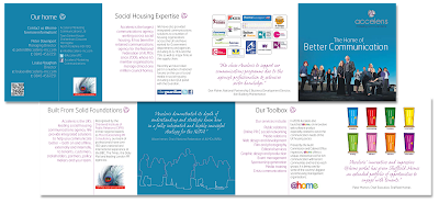
Hello. I'm a little late blogging this week, but there is a reason for that. I wanted to include a piece of work I have just done with Acceleris Integrated Communications Agency in Harrogate, and we agreed that I could showcase it on my blog on Wednesday. Today! So here it is... a little concertina fold, designed and written for a housing conference in Brighton - it highlights the many skills Acceleris possess in social housing. The cover image was originally intended for page 3, but I felt it was so strong that it should be the lead image. However, I thought it would be fun to trace around the staff members and duplicate the image on page 3 as a keyline illustration - I think it works really well too.

This is the first piece of work I have done for Acceleris and I thoroughly enjoyed the whole process. Hopefully there are opportunities going forward to work with them again. And again...

I thought I'd finish this blog with a quick 'How To' lesson in Photoshop masking. There are several ways of masking an image in Photoshop, but this one is really useful and quick, and gives really nice results.

Step 1: Open the chosen image, add a new layer and fill it with 100% solid white.

Step 2: On the white layer, add a Layer Mask

Step 3: Choose a nice big, soft edged brush (its trial and error to get the correct size, but it shouldn’t be bigger than the element of the image you are masking off, but not too small either) and make sure 100% black is the foreground colour.

Step 4: Choose an opacity of 20-40%(ish). Again this is trial and error to an extent.

Step 5: Gradually ‘paint’ over the part of the image that you want to be seen through the mask. Make sure you still have the Layer Mask selected while doing this. Because the opacity isn’t 100% (or anywhere near), the more strokes you do over a particular area, the stronger the image becomes. This is what giver the finishes product a nice soft edge though.

Step 6: Experiment. Sometimes it’s nice to include some of the background ghosting through. The more you try it, the better the results get, although its very easy to get great results from the off.

Right, that's it from me for now. I hope you find the Photoshop tip useful. I'm off for a quick run before getting back to work.

Visit www.howabout.co.uk

Friday, 4 March 2011

New clients, new relationships (professionally speaking)

Wow, what a busy week that was - and a very successful one too. I'm delighted to say that Howabout Creative Solutions had a couple of great meetings with Acceleris Integrated Communications Agency in Harrogate, the result of which is the prospect of Howabout working with them on their graphic design requirements from here on. Already I have designed a great little 8 page concertina-fold promotional brochure for them, which was very favourably received, and a larger magazine awaits my attention soon. Fab! Really excited by this development!!

Added to that, I did a day on location at Kariba Design Agency helping out with their heavy workload, and the signs are that this may be the start of a continued relationship. I hope so, as I really enjoyed the few hours I spent there, and it does make a refreshing change to get out and about occasionally and be in a studio with other like-minded creatives.

Added to that, two more projects were completed for York Test Laboratories, and a couple of ads for Clive Sutton luxury car dealership. All in all, another strong week for Howabout Creative Solutions in and around the Harrogate area (and beyond). Long may it continue!

Oh and I still had time to listen to some great tunes too: Jane's Addiction, Chemical Brothers, Skids, Beach Boys, Gorillaz, Orbital, Pop Will Eat Itself and Peter Doherty (as well as a few hours worth of the ever excellent 6Music).

Have a great weekend...

Visit www.howabout.co.uk

Monday, 28 February 2011

A couple of work examples


Morning, and welcome to another grey day - ah well, it's nearly Spring...

I thought I'd do a quick blog today showcasing a couple of recent bits of graphic design work that Howabout Creative Solutions in Harrogate have done for YorkTest Laboratories in York (appropriately enough!).

On show here is a Barracuda banner which I did for their recent roadshow. Although I was supplied several potential images to use, and was given the freedom to choose any others that I thought may be appropriate, I decided that to focus on just one image, with some nice typography was possibly the way to go. To me, a good banner stand should be impactful but not overloaded with information and graphics - there is only a short window of opportunity to grab potential customers' attention and I'm confident this solution will do the trick.

In addition, on show is just the illustrative aspect of a mailer for YorkTest Laboratories I did earlier in the month. The client wanted a good graphic design solution to illustrate food intolerance testing, and more specifically, to highlight some of the symptoms associated with food intolerance. Initially, I thought it would be a struggle to encompass all the symptoms and it would water down the message somewhat, but once I hit on this design approach I knew we were onto a winner, and the client agreed. It was a fairly simple Photoshop execution, but it works well, particularly as the text can follow the contours and sinews of the torso.

For more design solutions like these, please take a look at the Howabout Creative Solutions link below.

Visit www.howabout.co.uk
Friday, 25 February 2011

Importing tables into Adobe InDesign

Afternoon from Howabout Creative Solutions - the friendly (and creative) graphic design agency in Harrogate. We've had a good week here - it's been half term, so had my lovely daughter at home, which means work sometimes spills over into the evening after she has gone to bed, but projects continue to be delivered on time, on budget, and above the expectations of the clients. Which is nice!

Continuing my recent theme (okay I've only done 1 so far) of sharing graphic design tips 'n' tricks, I thought I'd briefly talk about importing and styling up tables in Adobe InDesign. I've encountered numerous occasions when I've been faced with working with huge Microsoft Excel tables, sometime running to several pages. At first glance, they look daunting to deal with, but it's really quite simple...

Choose the 'Place' option in InDesign and activate the 'Show Import Options' button. When you have located the table in question you will find it imports with the cells and data in place (although some elements may be flowing off the page boundary). Highlight an entire cell and then choose 'Edit: Select all' to highlight all the text. You can then apply your chosen font, size, colour etc. You can also grab the edge of cells and expand or reduce them to fit your page width, or rotate text within cells to run it vertically.

Next, and this is a useful tip, highlight the top row that contains the header for each column, right click and choose 'Convert to Header Rows'. If your table spans several pages, the details of this row will then appear at the top of every page.

Another useful trick is to put an alternating background pattern on the rows, to make them easier to follow from left to right, and to make the table more aesthetically pleasing. Highlight all the cells, right click again, go to 'Table Options: Alternating Fills: Alternating Pattern' and choose 'Every Other Row' and try a 20% tint of a colour for the first row, and a 30% for the next row. Just play around until you find a colour and tint that your are happy with.

In fact, highlighting all the cells, and right clicking gives you all sort of options - setting the colour and thickness of the cell strokes; distributing columns and rows evenly; adding and deleting rows and columns - the list goes on. It really does make styling tables up really easy, and crucially it means you don't have to manually input supplied data yourself, and run the very real risk of entering it incorrectly.

I hope you found this little exercise useful. I find it works well if done in conjunction with something loud and guitar driven on the stereo - Led Zeppelin or Jane's Addiction for instance - but that might just be me...

Have a great weekend.

Visit www.howabout.co.uk

Monday, 21 February 2011

Acrobat tips and tricks, Harrogate weather and ballet

Good morning, and welcome to a grey, cold and damp February Monday morning here in Harrogate. It's the perfect weather to stay in an work on some wonderful graphic design concepts - which is just as well, as I have a few to do, ranging from an exhibition banner, to flyers, direct mailers, pitch document covers and ads. Later in the week I also have a meeting with a Harrogate based company that, well, let's just say I'm really looking forward to. Really, really looking forward to. More about that later though.

It's half term week too, so got my lovely daughter at home all week, and my lovely wife for Monday and Tuesday too. Alice (that's my daughter) is appearing at the Harrogate Royal Hall later today in a Lynton Academy ballet production of Peter Rabbit and Friends. She will be taking the role of a frog, and is very, very excited, which is great to see, so although there is much to do today, really Monday belongs to her.

Anyway, I thought I'd expand the blog a bit to include a few design tips and tricks that may be of use. Today, a little Adobe Acrobat tip: If you receive an Acrobat file and find that it needs to be amended, but only have the reader version of Acrobat installed, it can also be done in Adobe Illustrator. It's amazing how much you can do actually, from changing text, to changing colours, to moving elements around - you can even open and edit multi-page pdfs (although only a page at a time). Okay, it can be a little labour intensive if there are lots of things to change (although really there shouldn't be, as a pdf file ought to be a final piece of artwork in its own right). There was one occasion though, when I was in possession of a 12 page presentation in Acrobat (but no source files) and had to input extensive amends to each and every page for a client to present later that day. What would have been an hour or so's work in InDesign took four hours plus in Illustrator, but it came together well and the client was none the wiser that I was, to use a technical term 'winging it'. Here endeth the lesson for today...

Right, enough talk about work, now a brief look at music... been revisiting a few old classics lately including The Wonderstuff's 'Hup', Mudhoney's 'SuperFuzzBigMuff' (great title, great album) and The Pogues' 'If I Should Fall From Grace With God'. If anyone has any recommendations for what I should be checking out (or if you simply what to slag off what I listen to), please feel free to leave a comment.

Have a great week - over and out.


Visit www.howabout.co.uk

Monday, 14 February 2011

Busy times for Howabout (graphic design in Harrogate)

Good morning all.

Last week was a busy one for Howabout Creative Solutions as we continue with our quest to be one of the very best graphic design agencies in Harrogate. As well as accumulating a reasonable body of work to get through, a great meeting was had at Acceleris Communications Agency in central Harrogate (I know, saying 'central Harrogate' paints a picture of a sprawling metropolis, which Harrogate certainly isn't thankfully, but this place really is pretty central), and work continued on the presentation I am to deliver at the B4B meeting at Baildon on Thursday (to promote to fellow members what graphic design services Howabout Creative Solutions can offer to them and others).

I'll post back here on how the presentation went later in the week, but in the meantime its heads down and back to work (while enjoying the sounds of Leftfield).

Visit www.howabout.co.uk

For more details on B4B check out www.lindabforb.co.uk

Wednesday, 9 February 2011

Website updates, work and testimonials (and Grunge)

Well the new Howabout Creative Solutions website seems to be generating favourable reviews. Its now a case of working on the SEO side of things and and making sure its presence is known to anyone looking for top quality design solutions from our Harrogate setup. We already look favourites to win some new business from a Yorkshire company (being deliberately vague here) and have had some more work from YorkTest Laboratories who have supplied a really nice testimonial for our website here... YorkTest testimonial

We have also lent our time and skills to Richard Taylor School in Bilton where I have been helping out with their school newsletter, which is written and designed by some of the pupils. Its great fun and very rewarding, and we are delighted to offer our support.

Finally, I have done a couple of days work with Words and Pictures in Otley, where they needed some design support at short notice. It was an enjoyable experience, and one which I'd love to repeat.

(Oh music recently has been supplied by largely Grunge and Grunge related offering, due to a fab CD on the front of Mojo magazine - Mudhoney, Vaselines, Melvins, Big Black etc etc. Great stuff that takes me back to my yoof, so it does!)

Visit www.howabout.co.uk

Wednesday, 2 February 2011

New Howabout website is up and running!!!

Woo-hoo, the new website for Howabout Creative Solutions in Harrogate is now live! Been feeling my way around Dreamweaver and CSS with the help of my lovely wife and the result is now there for all to see. (It's taught me a few new skills as well, this web building lark, so I'll continue to progress those in the days and weeks to come). It's great to have my Twitter feed linked to the site too, as well as this here blog, obviously. Hopefully it'll help to promote the good name of Howabout a bit more, and give a better reflection of the graphic design solutions we can offer the good folk of Harrogate, North Yorkshire, West Yorkshire and beyond...

Obviously a project like this can't be completed without suitable tunes to work to, and lately these have been provided by I Am Kloot, Toumani Diabaté, Red Hot Chili Peppers, and a bit of Jimmy Cliff.

As well as the new website launch, we have continued to provide great design solutions for the likes of YorkTest Laboratories, Clive Sutton, Beaucare Medical and others. Oh, and we won a pitch in Surrey last month to produce an annual report for OCS, which was a lovely start to the year. Howabout Creative Solutions definitely has a nationwide reach now!

Visit www.howabout.co.uk

Tuesday, 11 January 2011

Hello 2011, goodbye 2010

Okay, so I'm a little late to say 'Happy New Year' as we're already eleven days in, but Happy New Year anyway! I've got big plans for this year - firstly, the Howabout website is getting an overhaul to better reflect my graphic design work and to reflect the fact that I am Harrogate based (but with a regional and national reach, obviously). The visuals are more or less complete, and I'm pleased with the way they look, so now its just a case of building the site and getting it live - hopefully that will be complete sooner rather than later.

So far this year, I've completed a nice 4pp newsletter for Beaucare Medical in Harrogate, and am midway through a couple of bits of marketing material for YorkTest in York. Tomorrow I have a big pitch somewhere 'darn sarf' (being deliberately vague here) and it seems that I may have an additional client using my services come late Jan/Feb (being deliberately vague again). All-in-all, not a bad start to the year.

Oh, bought a new (well second hand) car late December as the last one was about to give up on me, so been working on a couple of compilation CDs for in-car listening. What do you reckon to one that includes Ash, Beach Boys, Skids, Julian Casablancas, Chili Peppers, Super Furries, Led Zep, Beatles and Charlatans (amongst others)?